


Menu
Work
About
Contact
Case Study
Hollow & Hearth
Redefining the comfort zone. A flexible brand system that balances the thrill of the Black Diamond with the warmth of luxury hospitality, inviting everyone to the outdoors.
BrandingMotionArt DirectionAdvertising

Challenge
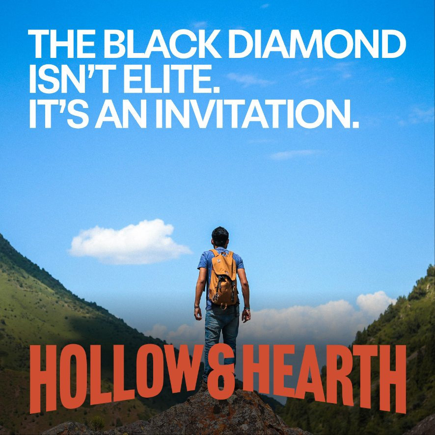
Hollow & Hearth sought to bridge the gap between luxury hospitality and rugged outdoor adventure. The challenge was to take the Black Diamond, traditionally a warning symbol for experts only, and reframe it as an invitation for everyone. We needed to remove the intimidation factor from extreme sports without diluting the excitement, encouraging guests to step out of their comfort zones.
Result
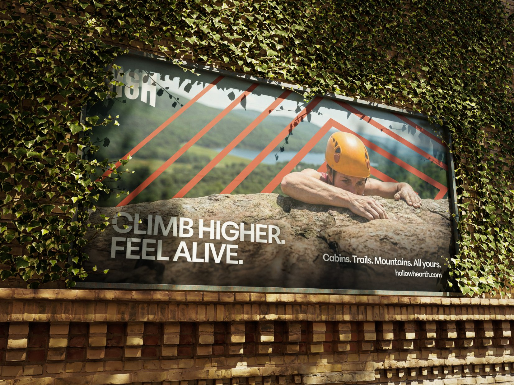
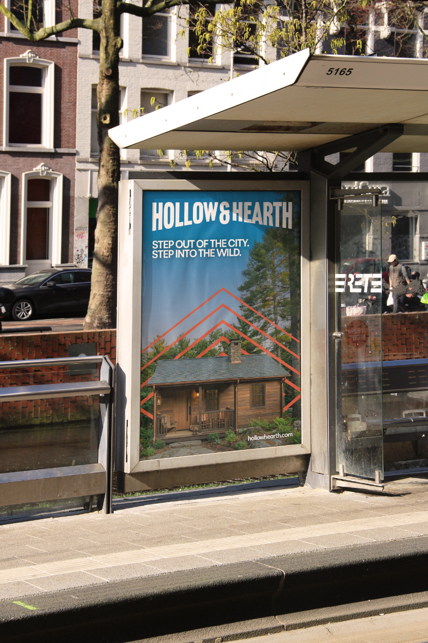
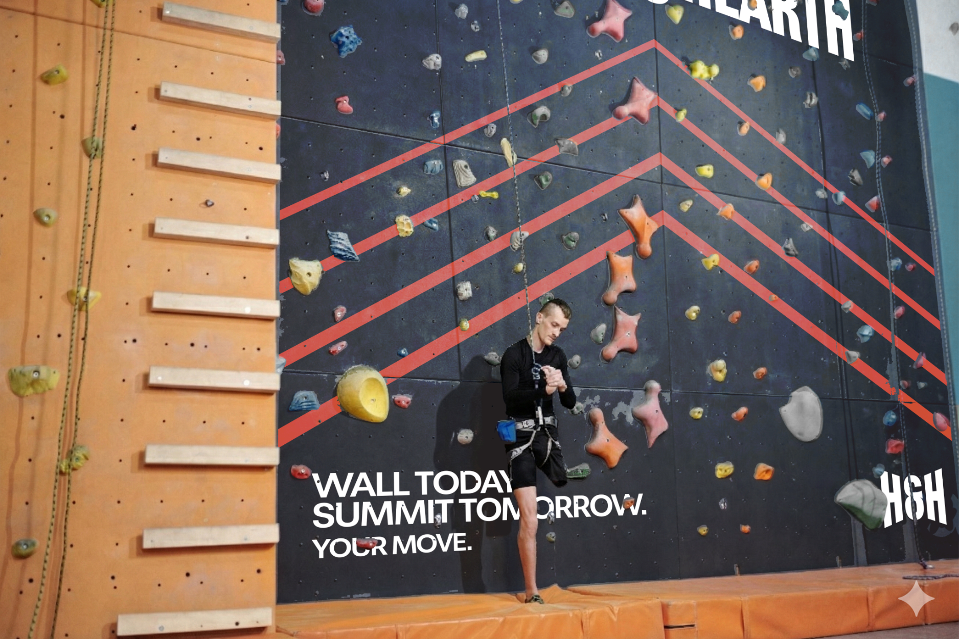
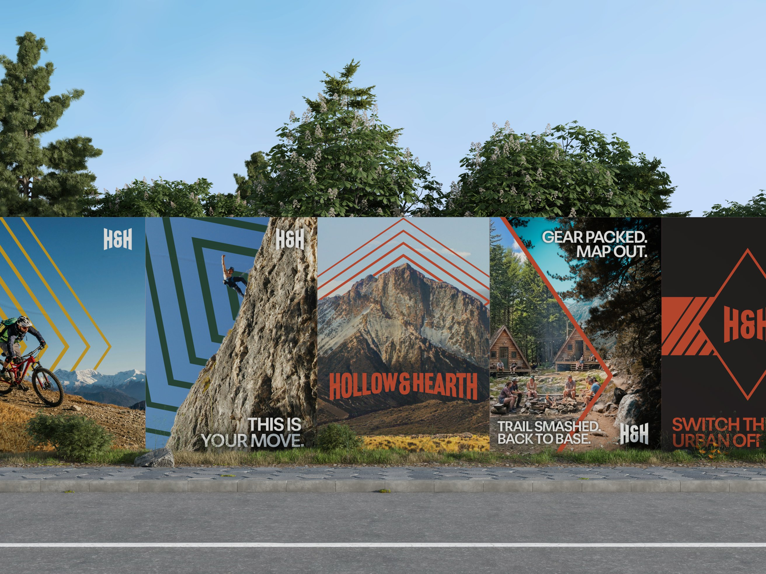
I created a comprehensive brand system that deconstructs the Black Diamond symbol into a symbol of accessibility. By breaking the diamond down into directional chevrons, the visual identity focuses on forward momentum and guidance rather than difficulty. This dynamic graphic system was rolled out across advertising, trail wayfinding, and merchandise, successfully positioning the brand as an empowering community for the modern adventurer.
The Ultimate Outdoor Retreat
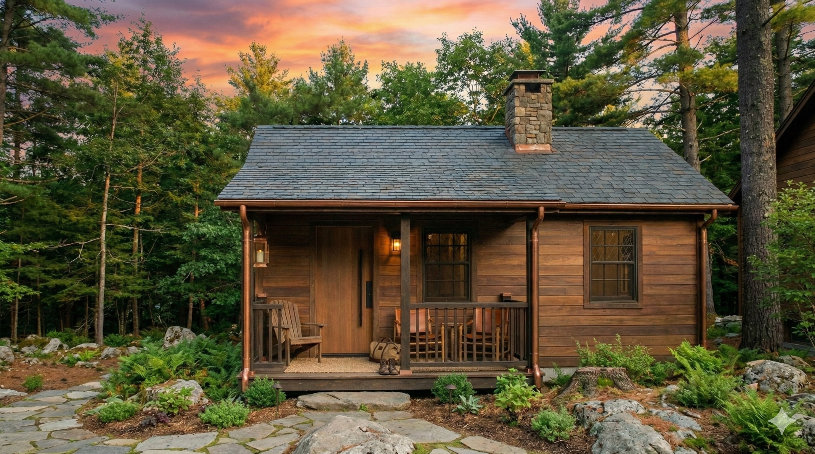
Hollow & Hearth is built for those who feel the pull of the wild but want a place to land when the day is done. It’s cabins buzzing with energy, trails mapped and ready, the fire pit already cracking with people gathering around it. Here, challenges are shared, stories are swapped, and every achievement — big or small — earns a patch, a moment, a memory.
This retreat makes adventure accessible without stripping away the thrill. Whether you’re chasing sunrises on the ridge or heading back to base to recharge, Hollow & Hearth gives you a community and a landscape worth coming back to.
More work


CONTACT
+447881908909
repsysdesign@gmail.com
SOCIAL


Case Study
Hollow & Hearth
Redefining the comfort zone. A flexible brand system that balances the thrill of the Black Diamond with the warmth of luxury hospitality, inviting everyone to the outdoors.
BrandingMotionArt DirectionAdvertising
Challenge
Hollow & Hearth sought to bridge the gap between luxury hospitality and rugged outdoor adventure. The challenge was to take the Black Diamond, traditionally a warning symbol for experts only, and reframe it as an invitation for everyone. We needed to remove the intimidation factor from extreme sports without diluting the excitement, encouraging guests to step out of their comfort zones.
Result
I created a comprehensive brand system that deconstructs the Black Diamond symbol into a symbol of accessibility. By breaking the diamond down into directional chevrons, the visual identity focuses on forward momentum and guidance rather than difficulty. This dynamic graphic system was rolled out across advertising, trail wayfinding, and merchandise, successfully positioning the brand as an empowering community for the modern adventurer.
The Ultimate Outdoor Retreat
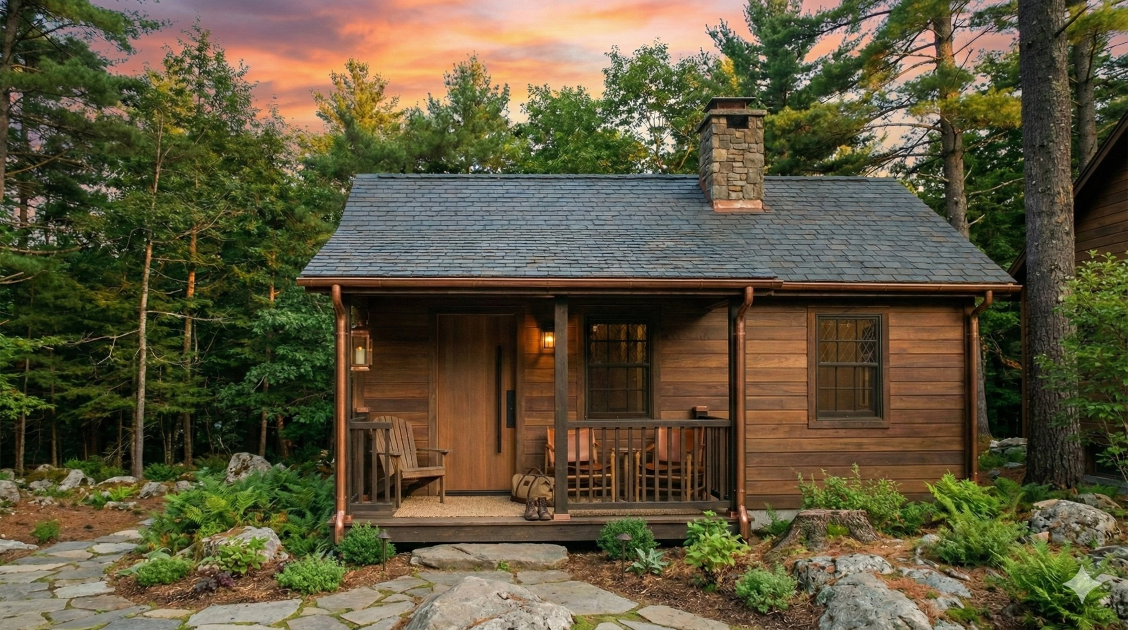
Hollow & Hearth is built for those who feel the pull of the wild but want a place to land when the day is done. It’s cabins buzzing with energy, trails mapped and ready, the fire pit already cracking with people gathering around it. Here, challenges are shared, stories are swapped, and every achievement — big or small — earns a patch, a moment, a memory.
This retreat makes adventure accessible without stripping away the thrill. Whether you’re chasing sunrises on the ridge or heading back to base to recharge, Hollow & Hearth gives you a community and a landscape worth coming back to.
More work


CONTACT
+447881908909
repsysdesign@gmail.com
SOCIAL

Case Study
Hollow & Hearth
Redefining the comfort zone. A flexible brand system that balances the thrill of the Black Diamond with the warmth of luxury hospitality, inviting everyone to the outdoors.
BrandingMotionArt DirectionAdvertising
Challenge
Hollow & Hearth sought to bridge the gap between luxury hospitality and rugged outdoor adventure. The challenge was to take the Black Diamond, traditionally a warning symbol for experts only, and reframe it as an invitation for everyone. We needed to remove the intimidation factor from extreme sports without diluting the excitement, encouraging guests to step out of their comfort zones.
Result
I created a comprehensive brand system that deconstructs the Black Diamond symbol into a symbol of accessibility. By breaking the diamond down into directional chevrons, the visual identity focuses on forward momentum and guidance rather than difficulty. This dynamic graphic system was rolled out across advertising, trail wayfinding, and merchandise, successfully positioning the brand as an empowering community for the modern adventurer.
The Ultimate Outdoor Retreat
Hollow & Hearth is built for those who feel the pull of the wild but want a place to land when the day is done. It’s cabins buzzing with energy, trails mapped and ready, the fire pit already cracking with people gathering around it. Here, challenges are shared, stories are swapped, and every achievement — big or small — earns a patch, a moment, a memory.
This retreat makes adventure accessible without stripping away the thrill. Whether you’re chasing sunrises on the ridge or heading back to base to recharge, Hollow & Hearth gives you a community and a landscape worth coming back to.
More work


CONTACT
+447881908909
repsysdesign@gmail.com
SOCIAL
